
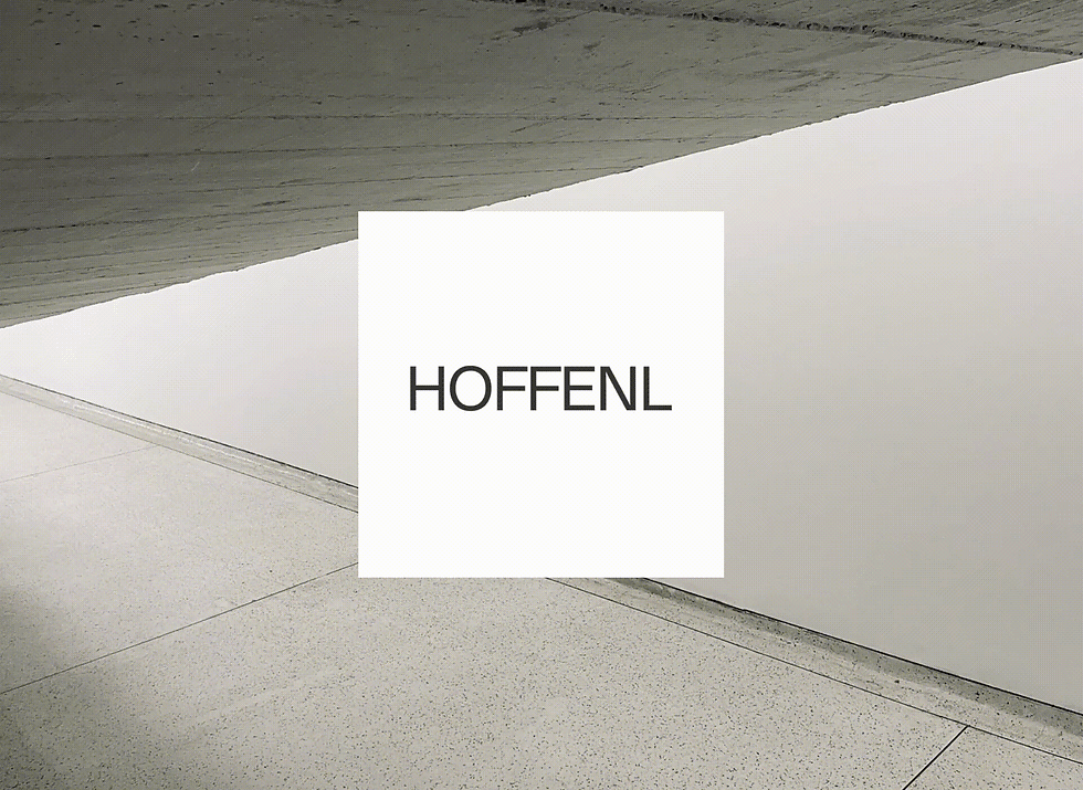


HOFFENL
SERVICES
CREDITS
TYPEFACE
Established by Lucas Fernandes, a Brazilian architect and product designer, HOFFENL is an architecture atelier in Belo Horizonte, Brazil. Lucas' inspirations come mostly from Modernism and Brutalism, two very different movements that create his interesting visual style. As a young architect, Lucas hadn't done many projects at the time. His atelier needed a visual identity to communicate his talent and vision to potential clients and gain their trust through visual languages other than his previous works.
The concept behind the new visual identity revolves around the H-profile of architecture, a reinforced structure composed of two flanges generally used to support heavy loads. Pillars, beams, and canopies of large projects are made up of this type of structure. Just like the H-beam, HOFFENL presents itself as a space of robust structure and strong basis, where clients can rely on to bring to life visionary ideas.
Having that in mind, the branding explores the first letter of the brand's name, H, which also represents the strong meaning of the H-profile. A timeless typography was used alongside with interesting architecture and raw materials photography that reflects Lucas' style – inspiring potential clients to dive into his universe and vision. The overall identity reflects the atelier's take on creating architecture that stands the test of time while also communicating Lucas' vision and style.
Art Direction
Brand Identity
Motion Design
Art Direction: Marcella Fagundes
Design: Marcella Fagundes and Lucas Fernandes
Animation: Marcella Fagundes
2022
Arket Sans

